The 5% deposit scheme is inflating the exact homes first home buyers can afford
When the Australian Government 5% Deposit Scheme went uncapped on 1 October 2025, it was meant to help first home buyers get in. New Cotality data shows it is doing something else as well: pushing up prices fastest in exactly the part of the market first home buyers are forced to shop in, and shrinking the pool of suburbs they can afford.
The findings
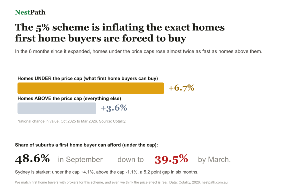
- Nationally, homes valued under the scheme price caps rose 6.7% in the six months to March 2026, against 3.6% for homes above the caps.
- In Sydney the split is starker: homes under the cap are up 4.1% while homes above it fell 1.1%, a 5.2 percentage point gap.
- The share of suburbs with a median house value under the caps fell from 48.6% to 39.5% between September 2025 and March 2026 (units from 92.7% to 89.1%).
- 81 of the 88 local markets Cotality looked at grew faster below the caps. It held in every capital, and in every regional market except regional WA and the NT.
Why this matters. The cap acts like a magnet on the cheap end of each city. Demand piles into the homes priced just under it, so the buyers the scheme is meant to help end up competing harder for a smaller and smaller pool of suburbs. It is not that the scheme fails to get individuals in. It is that, in aggregate, it is lifting the very floor it was built on.
Our position, stated plainly
NestPath runs a free service that matches first home buyers with brokers, including brokers who work with the scheme's panel lenders. So we benefit when people use it. We are publishing this anyway, because the data is hard to argue with and buyers deserve to see it. If anything, it makes the case for getting the structure right: which suburbs are still under the cap, and not overpaying into the segment the scheme is heating up.
See it for your own city
We built a free interactive that shows what a deposit reaches in each capital, and which suburbs sit under the scheme cap: the 5% Deposit Map. No sign up.
Buying into this market?
The point of a broker here is not to push a loan. It is to help you find the suburbs still under the cap and avoid overpaying into the part of the market the scheme is heating up. We match you with one for free.
Get matched with a free brokerMethodology and source
The numbers here are Cotality's, from their April 2026 analysis of the scheme, covering the six months to March 2026. They split each city by whether a home sits above or below its scheme price cap, then compared how much each side grew. Our part is the analysis and the chart, and we checked every figure on this page against their release. One thing to keep in mind: these are whole of segment numbers (under the cap versus above it), not individual suburbs, over a single six months. So read them as a signal about the market, not a forecast for any one home.
Free to embed
Journalists and writers are welcome to use the chart, free, with credit to NestPath. Paste this:
<a href="https://nestpath.com.au/5-percent-deposit-map">
  <img src="https://nestpath.com.au/the-5pct-trap.png"
       alt="The 5% deposit scheme is inflating homes under the price caps faster than those above. Source: Cotality, analysis by NestPath." width="640">
</a>
<p>Source: <a href="https://nestpath.com.au/research/the-5-percent-trap">NestPath analysis of Cotality data</a></p>
Want a version highlighting a specific city or state? Email hello@nestpath.com.au and we will cut one.
Related
- The 5% Deposit Map, an interactive of what your deposit reaches in each capital.
- First home buyer eligibility checker, every scheme in two minutes.
- Borrowing power calculator, for the serviceability side.